UX/UI design in 2026: trends that actually convert
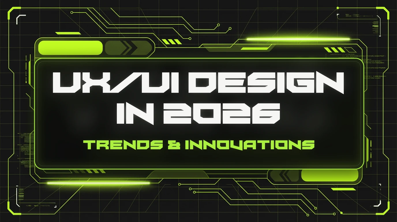
Website design isn’t just about “pretty” or “ugly.” It’s a sales tool. In 2026, there’s a clear link between “looks modern” and “actually brings in customers.” Here are the UX/UI trends that really affect conversion today — and why you should start adopting them now.
Dark aesthetics + accent colors
Dark mode is no longer just an option — it has become the standard in premium niches. A dark background reduces eye strain, makes the product stand out, and creates a sense of exclusivity. But dark design alone doesn’t sell — it sells when paired with the right accent color. Bright green, electric blue, or vivid orange on a dark background is what makes a CTA button “shout” and draw the eye.
Micro-animations and micro-interactions
Small hover animations, smooth transitions between sections, animated icons — none of this is just “effects for the sake of effects.” Micro-animations increase time on site, make the product feel “alive,” and build trust. Research by Nielsen Norman Group shows that well-designed micro-interactions boost NPS and purchase intent.
Cinematic storytelling
The most successful websites of 2026 tell a story. Not just “here are our services,” but “here’s your customer’s problem → here’s how it unfolds → here’s the solution → here’s the proof.” Each section takes the visitor along an emotional arc. It’s a principle borrowed from the film industry and storytelling — and it has a direct impact on conversion.
Asymmetric layouts and spacing
Grid layouts with identical blocks are becoming a thing of the past. Asymmetry, unconventional spacing, “broken” grids — all of this creates tension and dynamism that hold attention. The rule: asymmetry must be intentional and follow an internal logic; otherwise, it will just look messy.
3D elements and depth
Three-dimensional objects, illustrations with depth, pseudo-3D effects — a popular trend in tech and product niches. They add “weight” to a product and a sense of physicality. But keep in mind: 3D elements must not slow the site down. If an animated 3D object lags, it ruins the UX instead of improving it.
Typography as design
A big, bold headline is a design element in its own right. In 2026, text stops being just “content” and becomes part of the visual language. Variable fonts, unconventional typefaces, sharp contrast between large and small text — that’s what makes a website memorable.
Speed as part of UX
The best design is worthless if the site takes 6 seconds to load. Core Web Vitals aren’t just SEO metrics — they’re indicators of UX quality. LCP (Largest Contentful Paint) under 2.5 seconds, FID under 100 ms, CLS under 0.1 — these are the standards every website should meet in 2026.
Personalized microcopy
Button labels, form hints, error messages — that’s microcopy. And it’s the part that gets underestimated most often. “Submit” and “Get a free consultation” are radically different buttons in terms of conversion. Microcopy should be written from the perspective of the customer’s benefit, not the system’s action.
The bottom line
UX/UI design in 2026 is a balance of beauty, functionality, and sales. Theonebly builds websites where every pixel has a purpose. If your current site looks like a relic of the past, now is the time to fix it. Book a free design audit and find out exactly what stands between your website and your customers.